trying architexa – an eclipse diagramming plugin

Architexa recently announced free licensing for individuals or teams of up to three.  I figured I’d run it against CodeRanch JForum to see what happens.

Requirements/Install

The software is an Eclipse plugin.  You get the link after registering.  A different update site is provided for Eclipse 3.X vs Juno (4.2).  I know some CodeRanch JForum developers use IntelliJ IDEA.  I don’t, so I can try it out.  The install was smooth.  I did get asked to confirm I trust the certificate within Eclipse.

One minor discrepancy.  The website says the software is free for individuals and teams of up to three developers.  The email confirming your email and welcoming you says the software is free for individuals and teams of up to four developers.  Moot point at the moment since I’m using it as an individual.  But Architexa should sync these up.

The email asks me to validate my email using a localhost link.  Same for editing my profile.  I can’t click on it to validate.  Hm.. I then went to the website and clicked the “forgot password” link.  This got an emailed password which I could use to validate in Eclipse itself.  Again the change password link is a localhost link.  After entering that password, Eclipse said my account was validated.  So while the links are broken, I’m in the tool.

Learning curve

Architexa asks which projects it should index.  I said just JForum.  Architexa provides good Eclipse “cheat sheets” to start out quickly.

Layered Diagram

This is like a dependency graph for packages.  Very nice.  If you mouse over, you see incoming (afferent) and outgoing (efferent) dependencies.  You can also drill down to see lower level packages.

Class Diagram

Right clicking a package opens the option to create a class diagram.  Two classes generated on top of each other, but I can drag them around (or highlight them or call other attention.)  It is easy to view the source code from the class diagram.  I don’t see how to view the method names/fields in the class diagram.  This info is available in the outline view in Eclipse already though so it isn’t critical.

Sequence Diagram

This appears to be an enhanced editor.  You drag classes into it and it shows calls.  This seems like more work to create.  I tried dragging a few items over and “add all” to get the calls.  Unfortunately calls aren’t so much within one or two classes so this didn’t help much.  I didn’t create anything worth taking a screenshot of.

Overall opinion

The package diagram caught my attention the most.  I really like the dependency arrows.  The class diagram provides a nice visualization as well.  The sequence diagram seems like it would be a good documentation aid if one was creating sequence diagrams for the project.  Which I’m not because we inherited the design of the code and I’m already familiar with the flow.  I think more value would come from sharing documents and using the tool as a team.

For a “real” (paid) project, I”m not sure I’d be so thrilled to keep my documentation in a proprietary tool. Even a free one.  But for getting a feel for the software on a product that is “documentation-lite” or “no documentation”, the layered (package) diagrams and class diagrams provide a nice way to jump in.  Assuming you are using Eclipse already of course.

Apple OS X Lion Review – Part 2

In my release-day review of Apple’s Mac OS X Lion, I shared my initial impressions of the operating system while highlighting the key differences from previous versions. I also pointed some features users might not like. Now, two weeks later, I am much more appreciative of OS X Lion and wondering how I lived without certain features, such as full-screen mode. There are still some things I am not too fond of, but overall I have a much more favorable view of the new OS X after spending two weeks with it.

1. Full-Screen & Spaces Magic

Apple originally released Spaces with Mac OS Leopard 10.5, but until OS X Lion 10.7 I had never really used it. Spaces utilizes multiple virtual desktops in which to launch applications. The beauty of Apple’s implementation of full-screen mode is that it auto-magically creates and removes Spaces as the user switches into and out of full-screen mode. As a developer, I’m impressed by the clever re-use of existing functionality in an entirely new way. As a user, I like the new interface and beauty with which it works.

I was in the Apple Store over the weekend and compared the new 11″ MacBook Air running Safari in full-screen mode with a 13″ MacBook Air running the same application in windowed mode. Surprisingly, the height of the window was nearly the same. By introducing full-screen mode, Apple has essentially increased the screen size of all existing Macs, making the 11″ feasible as a true laptop replacement for the first time.

The addition of full-screen mode throughout the OS is probably the single most important feature Apple has release in OS X Lion. I only wish more third party applications, such as Microsoft Office and TextMate (the best Mac text editor) supported it automatically, but we will have to wait for a software update from the vendors. For those using Eclipse, Alex Blewitt has provided an unofficial update to support full-screen mode in OS X Lion that works perfectly in Eclipse 3.7 Indigo, although unfortunately not in previous versions of Eclipse. There is some concern that large manufacturers, like Adobe and Microsoft, could charge an upgrade fee for the next version that includes full-screen support, but this is up the individual vendors to decide.

2. New Mail App

In my initial Mac OS X Lion review, I indicated that I liked the Mail application, but did not go into much detail. After two weeks of using it, I’ve come to the realization that I love the streamlined, full-screen interface. It makes reading mail much simpler and less cumbersome than most modern mail applications, such as Mozilla Thunderbird or Microsoft Outlook. Also, I really like the conversations interface, borrowed a bit from Google’s Gmail web interface, which shows related messages, including your replies, in a single vertical view. Overall, this makeover makes for a much more solid, user-friendly application.

3. New Multi-Touch Gestures

The new 3-finger gestures are quite fun to use, such as pinching to make the Launchpad appear, or sliding the current page back in Safari, as an alternative to the back button. While it is getting a little difficult to remember all the different gestures available, they are playful and add a new level to the Mac. I have noticed some novice users trip up on multi-touch gestures though. For example, a particular family member of mine accidentally zoomed out on her Desktop resulting in all of the desktop icons shrinking to an unusable size. I would recommend that Apple turns off many of the advanced multi-touch gestures and enables them gradually and with the user’s permission, so that less skilled users understand how they work better.

4. All My Files: The Onion Prophecy Comes True!

Over two years ago, The Onion released a video showing a mock MacBook Wheel laptop, in which the entire keyboard is replaced by a single button, in part to mock Apple’s reliance on single-button hardware. In the video [at 1:06], they show a user searching their computer with all of the files in a single folder. Apparently, someone at Apple was taking notes, because the new version OS X Lion comes with an “All My Files” option in the finder menu. If you are like me, and have thousands of documents, I have no idea when this feature would ever be useful. In fact, if you use iPhoto and iTunes to manage all of your photos and music, there is never a reason to include them in this window. Overall, this feature seems like a last minute addition by an unskilled developer that probably should have never made it to the final build. You can turn this feature off by either right-clicking on it and removing it from the Sidebar, or unchecking the option in Finder -> Preferences -> Sidebar. Since it found thousands of useless icons and web files, I turned this feature off after a week as I decided it was a complete waste of time for anyone with more than a few dozen content items on their computer.

5. The Leftovers: What’s still bad

After reflecting on the topic, I’ve come to realize Mission Control, while useful, is so much like Exposé, that Apple really shouldn’t be highlighting this as a brand new feature. Perhaps not enough people were using Exposé, but this feels like a completely recycled feature with nothing of value added.

As for Natural Scrolling, in which they reversed horizontal and vertical scroll directions in OS X Lion, one person suggested they were trying to make a consistent interface with the iPad. If Apple ever does release a touch-screen Mac, this would certainly be the ground work for it. I decided to re-enable the natural scrolling following launch day and ultimately, it makes no difference to me which method I use. I still contend changing a major component of a user interface without explicitly informing the user is a horrible idea, as it tends to confuse the less-informed user base.

Finally, if you are Rosetta user who depends on older versions of applications, you may want to postpone upgrading at this time. I still content Microsoft Office 2004, which no longer works in OS X Lion, is the best version of Office released for Mac in the last decade due to its exclusion of the annoying ribbon, and inclusion of scripting support removed in Microsoft Office 2008. Users of Adobe CS2 or earlier, or those Photoshop CS3/CS4 users that rely on Droplets for batch processing, should likewise wait, as these products no longer function in OS X Lion and Adobe products can be quite pricey to replace. Unfortunately, Adobe has announced that it will not be providing Droplet support for CS3/CS4 users.

Minor Installation Woes

Having experienced serious installations issues on release day with Snow Leopard, I am pleased to report the installation of OS X Lion amongst my family members went almost entirely without problems. One computer did have a minor issue in which it restarted in Lion Recovery mode following the first reboot part of the installation. I needed to select the built-in hard drive as the Start Up disk, reboot the computer, then restart the entire installation. This solution worked, and have not seen any other installation issues.

Conclusion

The performance issues that I reported in my first review of OS X Lion eventually subsided, although it took all day. Between Spotlight indexing the entire hard drive and Time Machine backing up all of the changes, my computer was so hot I couldn’t touch it for hours after installation. Since then, the performance has been about the same as in 10.6 Snow Leopard, the previous version of Mac OS X. At this point, I am changing my satisfaction with OS X Lion from 35% previously reported to 90%, with the bulk of it stemming from the new full-screen mode that makes an 11″ MacBook Air perform like a 13″ MacBook Air.

There are still some rough edges, but overall this update is a welcome change and, unless you are one of those unfortunate users dependent on a Rosetta application, it is no-brainer upgrade at a $30 per household and a nearly error-free installation.

Apple OS X Lion Review

Shortly after downloading and installing Apple’s new Mac OS X Lion this morning, I started compiling a list of what I liked and what I did not like. My excitement began to fade as I realized there was a lot I was not going to enjoy about Apple’s new OS. After spending the morning with OS X Lion, I present a review that highlights both the good and bad of the new OS, along with tips to revert some new, possibly unwelcome features.

The Good

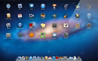
1) Launchpad: Launchpad is a new user interface component, which allows you to view the Applications on your computer in an iOS-like fashion. While I am not sure I will use this new interface, I like that Apple is trying to bridge the Desktop OS X and Mobile iOS worlds with a more consistent interface.
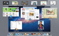
2) Mission Control: Although this feature is a bit recycled from Exposé, I do enjoy the new look and organization of the application overview.

3) Easy Access to DVD Media: When OS X Lion was first announced, there was a lot of uproar about the digital-only release. There were many who worried about how to do a fresh install of Lion on a new hard drive and the instruction, purportedly from Steve Jobs, that they install an old version of Mac OS then upgrade to Lion was met with a lot of online criticism. Most of those issues have since disappeared as Apple has provided a method, possibly unsupported, for creating a DVD image of the downloaded Lion installation. The steps are extremely easy and I had the DVD created within minutes of downloading. I tested the DVD on another Mac in my household, as the OS X license permits up to 5 installations, and the DVD worked without issues.

4) Full-screen Applications: The ability to load applications in full-screen was first introduced in iLife about a year ago and has now been extended throughout the OS. As someone who values screen real estate, the new feature is a welcome addition, especially if you are using an 11″ MacBook Air.

5) New Coat of Paint: The overall graphical interface for Lion is a lot more crisp and appealing, succeeding with that ‘lickable’ aspect Apple is known for.

6) Java Support: Like the DVD media issue, there were a lot of rumors predicting the end of Java on OS X Lion that have turned out to be false. Although there is some evidence to suggest Apple will be taking a backseat to integrating Java with the OS in the future, they have already posted a Java 1.6 release available as a separate download. They have also added an automatic download feature that detects when Java is required and automatically installs it. For example, the first time I started Eclipse, Java 1.6.0_26 (64-bit) was retrieved and installed within seconds. In short, Java is still very much alive and well in OS X Lion despite rumors to the contrary.

The Bad

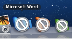
1) Microsoft Office 2004 Dead: OS X Lion removes Rosetta compatibility, which means older applications such as Word, Excel, or PowerPoint 2004 will no longer load. In fact, Lion highlights such applications as shown in this screenshot. I am actually a big fan of Office 2004, as I have used more recent versions and been turned off by the annoying ribbon interface. Office 2004 was one of the best versions of Office and is now completely dead in Lion.

2) Slow: Ever since I started is up, OS X Lion has had an unreasonably slow user interface, especially in terms of responsiveness. As early as the login screen, I had to wait 10+ seconds after selecting my username to enter my password. My computer may not be fresh off the assembly line but it is still a somewhat new high-end MacBook Pro, so I’m shocked at the user interface delay in loading and using programs. Even loading System Preferences and the OS X Updater took a lot of time.

The reason for these delays may be that Spotlight runs a re-index of the hard-drive immediately following installation, but I’ll have to wait until it is finished to know for sure. Initially, Spotlight reported “4 weeks remaining” but that has since changed to 7 hours, which is better, but still a lot of time to wait. The extra process is also causing the temperature to spike and it practically burns my hand to type right now. It’s like taking a new sports car out on the road but not being able to go above 5 miles per hour, while the seat slowly burns your legs. It certainly diminishes the initial user experience after installation and should have been scheduled to occur at a later time.

Update [7/22/2011]: After Spotlight finished re-indexing the hard-drive and Time Machine ran its multi-gigabyte backup, the computer is running much better again. I still notice some impact lag when typing passwords and launching certain applications, but I can’t say for sure if this was much different than before I upgraded. In retrospect, I still contend Spotlight should have postponed its re-index of the hard-drive as this created a poor user experience immediately following installation.

3) Unnatural scrolling: For some reason, Apple decided to reverse the scroll direction. Up is down, down is up, left is right, etc. According to the documentation is this a more ‘natural’ approach, but from a user interface perspective reversing such a now-key part of the user interface is ridiculous. Luckily there is a way to disable this ‘feature’. Open System Preferences, select Trackpad, and uncheck the option for Scroll direction: natural. On older Macs, Apple presents this in a different manner, and to disable it, uncheck When using gestures to scroll or navigate, move content in the direction of finger movement

4) Launchpad + Parallels: One area where I found this particularly troublesome is if you have Parallels installed, it lists dozens, or even hundreds, of Parallels applications in Launchpad, often outweighing the number of OS X applications. This may not bother a lot of people, especially those that keep Parallels open at all times, but was extremely frustrating for myself. These items can be removed from Launchpad by opening Parallels and selecting the virtual machine. Then from the menu bar then select Virtual Machine, click Configure, select Applications, then uncheck Share Windows applications with Mac.

5) iChat Single View: iChat has been updated to automatically merge multiple buddy lists into one. Some people may like this feature, but I found annoying that it was enabled by default. Lion also overwrote many of my default preferences, such as hiding the hundreds of Offline Buddies on my list. None of these are killer issues, but did annoy me the first time I loaded iChat. To disable it, select Preferences from the menu bar, click General, and uncheck Show all my accounts in one list.

6) iChat won’t save account passwords: I’m having an issue that every time I start iChat I need to enter passwords for each of my accounts, despite having previously saved them in my keychain before the upgrade as well as checking the box to save them in my keychain now. I haven’t heard anyone else report this issue yet, but something seems buggy here.

Update [7/22/2011]: One website suggested my iChat preferences had been corrupted. The fix is to navigate to ‘/Users//Library/Preferences’ and delete all com.apple.iChat* files. You must then log out for the fix to work and re-setup iChat the next time you log in. I’m pleased to report this solution does work and I can now open and close iChat without having to reenter my passwords each time it starts up. Has anyone else installed OS X Lion, only to have their iChat preferences corrupted?

Some users have reported similar issues with Calendar passwords after upgrading to OS X Lion in which the solution was also to manually delete user Library files.

7) Adobe CS2 Dead: As Adobe has pointed out CS2 and earlier versions of its products do not function in OS X Lion due to the same Rosetta issue that disabled Microsoft Office 2004. More recent versions, such as CS3/CS4/CS5 still have a number of issues as Adobe spells out in its release notes.

Some components of Photoshop, such as Droplets, the automation creation tool, were sloppily implemented in PowerPC even in recent Intel-based versions of Photoshop. Adobe has released an update for CS5, although it is not clear if they will be updating CS3 or CS4, but given Adobe’s update history for older versions of it’s product, it seems unlikely.

Conclusion

Overall, I’m about 35% happy with OS X Lion. While I like the streamlined interface, new Mail client, and increased feature set, I can’t help but think they needed to spend more time on this. The erasing of many of my existing settings throughout the OS and applications, as well as needing to wait hours for the computer to finish running Spotlight before I can use it without burning my hands, leaves a bitter taste in my mouth. The biggest showstopping feature is the lack of support for Microsoft Office 2004, as I consider this version to be superior to many of the newer versions. More of my impressions will follow as I get more familiar with the many new features of this OS.