resizing columns in wordpress

Our OCP 11 (IZ0-815) book is at the printer. It comes out this month! In fact we are doing a CodeRanch promo for it next week. The book comes with an online test bank. The online bank includes two full length mock exams and every question in the book.

While uploading our questions to the test bank software, one of the test bank staff noticed an error. Two of our answer choices were the same. Luckily this wasn’t the correct answer, so a pretty minor errata. But it is our first errata so time to start the errata list.

For our Java 8 books, we used an HTML table for the errata list because our WordPress instance didn’t have table support. Editing the HTML was a pain so I was happy to see that now there are native WordPress tables. So I tried it out. Easy to enter data, add/remove rows/columns. Excellent. It’s all you could want in a table editor. Well. Almost.

Attempt #1

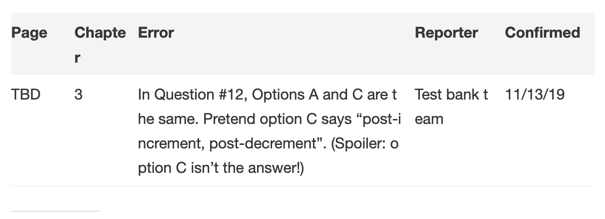
I chose the striped option. And this is what I got my default. I agree that the error column is the most important. And it’s nice that it is wide. But the other columns are so narrow to be unreadable.
Attempt #2

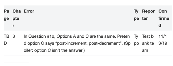
I looked at what my options were on the table. There was only one option that looked relevant. So I clicked it

Yuck; that’s even worse. The error column is the most important and it is so narrow it is hard to read. And there is lots of wasted whitespace.
Attempt #3

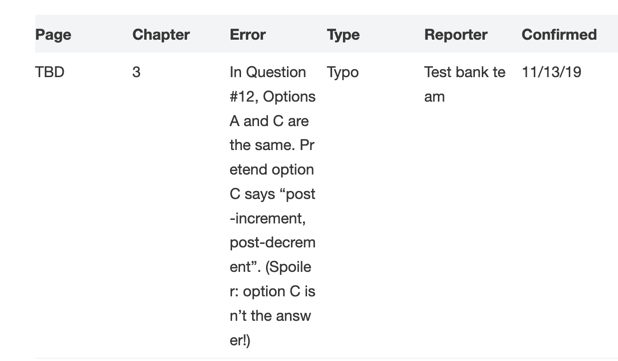
I got rid of the Type column to get a bit more real estate. Then I discovered there was a CSS option. I made up a unique CSS class name. Given that 815 is in the exam name, that sounds unique on our site.
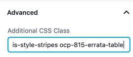
I also went to the Additional CSS screen:

  • Settings
  • Appearance
  • Customize
  • Additional CSS

I added this CSS:

/* By default, wordpress only allows default or equals column size. Both look bad on the errata table so using CSS to customize */

/* page # */
.ocp-815-errata-table td:nth-child(1) {
  width: 10%;
  }

/* chapter #*/
.ocp-815-errata-table td:nth-child(2) {
  width: 10%;
}

/* actual errata */
.ocp-815-errata-table td:nth-child(3) {
  width: 50%;
 }

/* reporter */
.ocp-815-errata-table td:nth-child(4) {
  width: 15%;
 }

/* confirmed */
.ocp-815-errata-table td:nth-child(5) {
  width: 15%;
 }

Finally I published and got:

Live Blogging with an iPad – part 2

iPad with Keyboard and DockScott wrote about his iPad live blogging from The Server Side Java Symposium flurry of posts.  While I wrote a little bit about the iPad at the time, I too wish to reflect.  My perspective is a bit different since I operated almost exclusively with the touch screen keyboard.

My path to blogging

Since this was the first time I was live blogging from my iPad, I was learning as I went.  I encountered a few things that didn’t work over the course of a day and a half.

WordPress iPad App

I was excited to see there was an app for WordPress.  I tried this app at home and it was fine.  Turns out it was fine because I was typing everything in one setting.  Problems:

  1. Despite indications to the contrary you can only have one draft in the iPad app at a time.  This wouldn’t be so bad if they provide a warning when you try to create a new draft.  Instead they silently delete the first draft.  FAIL.  I lost a whole blog entry that way.  The website indicates you can have multiple drafts, but it didn’t work when I tried it.
  2. One of my blog entries posted twice.
  3. I learned of other even worse problems that I didn’t encounter first hand.  Scared me sufficiently to jump ship though.

The WordPress web page

I started out happily typing in the wordpress app.  Then I got to a screenful of content and no scroll bars appeared.  Using one finger to scroll scrolled the whole page and not the textarea.  (see below for solution) My blog posts tend to be long.  Since I didn’t know how to scroll, I deemed the web page approach unusable and looked for a better solution.

Notes

I spent a while typing my text in Notes and copy/pasting it into the WordPress app.  This worked ok, but I got frustrated typing HTML characters.

HTML Editor

I thought HTML editor would solve my problems with Notes because it would be less tedious to type “<“.  Turns out not so much.  While the “<” was on the main screen, the “/” was still not.  (Anyone know of an HTML editor that is easier to use.)  Granted this wouldn’t be a problem on a Bluetooth keyboard because then all the keys are on a keyboard.  More importantly, the editor didn’t wrap text making it hard to read what I wrote.

The WordPress web page – redux

I later learned that you can scroll in the textarea by using two fingers.  Once I figured out how to scroll, I stayed with the web page for my blogging.  I’m wondering if the two finger scroll is supposed to be something “everyone knows” ?

The Bluetooth keyboard

Scott lent me his Bluetooth keyboard to try out for blogging a session. Unsurprisingly, it feels like a real keyboard so I touch type faster and more accurately than on the iPad directly. It’s also really easy to configure. Scott paired it to my iPad right in front of me.

I wouldn’t buy one for two reasons:

  1. The point of an iPad is to have less to lug around. I can’t see myself carrying a metal keyboard.
  2. I wouldn’t use it often so it’s not worth it for me.

Why it is useful:

  1. HTML is so much easier to type on a real keyboard. To the point where I am still actively avoiding it when typing on the iPad.
  2. It’s great having arrow keys to move between lines. Turns out I didn’t miss that at all when I was typing on the iPad because then using my finger on the touch screen was convenient. With the iPad screen a good 6 inches from my hands, I revert to my “use the keyboard over the mouse for almost everything” habits.
  3. You get a full screen on the iPad since they keyboard isn’t using half of it. While this is cool, it turns out not to matter for me, because I’m watching the speaker and only looking at the screen rarely to see what the iPad has “auto-uncorrected” for me.

Basically, it’s not better enough to be worth it for my usage pattern.

An interesting side note: I forgot the part where you have to look for a few keys when you get a new keyboard like the “end” button.

Conclusion

I’m surprised how fast my iPad typing speed has gotten. I am able to touch type with all ten fingers at a “fast enough” speed. And I can often do so without looking at the keyboard. Unless I need a single quote of course. Then I need to look to find the special symbols button.

Also, turning off autocorrect helped as Scott noted.  This helps because the iPad un-corrects technical words. There are a lot of those at a conference. The downside is that turning off auto correct also turns off spellcheck. I could still use spellcheck.

All in all, it took a day, but I am able to blog on the iPad in a sustainable fashion.  Six thousand words later, I had fun doing this.

I got a tip yesterday to turn off auto correct.

Eek wordpress – from the server side java symposium

Switching to the web interface over the iPad app for live blogging. I’m a bit annoyed the word press iPad app lost my post because I started a second draft. I also noticed the app posted my blog entry twice. While researching this, I learned of other even worse problems.  Using the web interface exclusively now.

Update: turns out word press doesn’t scroll properly in the browser  on iPad. I’m now up to blogging in notes and copy/pasting it in

Update: added the 99 cent HTML editor so I can get to the <> keys more easily and add some formatting as I write

Update: the HTML editor I tried doesn’t wrap text. There is probably a better editor, but I don’t have time to find it during a conference so I am back to Notes.

Update: i finally found out how to scroll in safari. Two fingers in the textarea and drag. Now trying to blog in the wordpress browser ui again.  Stayed with this for the rest of the conference